
The ampersand (&) comes from the Latin word “et,” meaning “and,” and has evolved over centuries from handwritten ligatures into a key element of modern design. Its shape developed through medieval manuscript practices and became more standardized during the Renaissance, adapting to different fonts and styles. Today, you’ll see it everywhere, from logos to digital fonts, blending history and contemporary aesthetics. If you keep exploring, you’ll uncover more about its fascinating journey and current uses.
Key Takeaways
- The ampersand (&) originates from the Latin word “et,” meaning “and,” and evolved from handwritten forms during the Roman Empire.
- It developed through medieval manuscript practices, becoming more stylized and standardized during the Renaissance with advances in printing.
- Historically, the ampersand served as a space-saving symbol in manuscripts and early printed texts, influencing typographic design.
- Today, it is widely used in branding, logos, and digital media, with styles ranging from decorative to minimalist in modern typography.
- The ampersand continues to connect historical typographic roots with contemporary design, maintaining cultural significance across centuries.
Have you ever wondered why the symbol “&” is so widely used to represent the word “and”? Its popularity isn’t just a matter of convenience; it has a rich history that traces back centuries. The ampersand’s origins lie in the Latin word “et,” meaning “and,” which early scribes combined into a single character. Over time, this ligature evolved through various handwriting styles, gradually transforming into what we now recognize as the “&” symbol. During the Roman Empire, craftsmen and scribes experimented with different ways to connect the letters “e” and “t,” eventually creating a flowing, stylized symbol. This evolution continued through the medieval period, influenced heavily by the development of typography design, as scribes and printers sought more efficient ways to write and print. The ampersand became a staple in manuscripts and early printed books, often serving as a space-saving device in texts and lists.
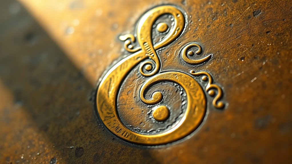
As printing technology advanced during the Renaissance, the design of the ampersand became more standardized, though it retained a variety of forms depending on the typeface. Typography design played a significant role here; different type foundries crafted their own versions to suit aesthetic preferences. For example, the classic serif fonts of the 16th and 17th centuries often featured ornate ampersands, while modern sans-serif styles tend to favor cleaner, minimalist shapes. The symbol’s versatility allowed it to adapt seamlessly across different typographic styles, which helped cement its place in both formal and informal writing.
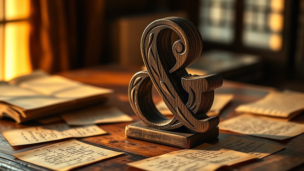
Today, the ampersand continues to evolve within contemporary typography. Designers experiment with various styles, from highly decorative to sleek and simple, to suit modern branding and digital interfaces. It’s used not only in formal writing but also as a stylistic element in logos, product names, and social media handles. Its visual appeal lies in its ability to combine form and function—serving as a shortcut for “and” while adding aesthetic flair to text. Despite its long history, the ampersand remains relevant because it embodies centuries of typographic evolution and design innovation. Whether in vintage typefaces or modern digital fonts, this symbol connects us to a shared visual language that’s both historical and contemporary. Its enduring presence proves that a simple symbol, rooted in centuries of evolution, can continue to adapt and thrive in our visual culture.

Arial Font White Painted MDF Wood Symbol & Ampersand 6 Inches
Aprrox. 6 Inches tall x 0.5 inches thick (15 cm high x 1.2 cm thick)
As an affiliate, we earn on qualifying purchases.
As an affiliate, we earn on qualifying purchases.
Frequently Asked Questions
How Is the Ampersand Used in Different Languages?
You’ll find that the ampersand’s usage varies across languages, reflecting linguistic variations. In some cultures, like Latin-based languages, it’s common in formal writing, while others avoid it in favor of “and.” You might face translation challenges when converting texts with ampersands, as their meaning and style can shift. Recognizing these differences helps you communicate more accurately and adapt your writing to suit each language’s conventions.
Are There Font Styles Where the Ampersand Is Banned?
Yes, some font styles are banned due to font restrictions or branding guidelines, especially in official documents or logos. Companies often specify which fonts are acceptable to guarantee consistency, and certain fonts may omit the ampersand or use a specific style to match their branding. You should always check font restrictions before designing materials to avoid using styles where the ampersand is prohibited or looks out of place.
What Are the Legal Implications of Using the Ampersand in Trademarks?
Have you considered the legal restrictions of using an ampersand in trademarks? When you register a trademark, using an ampersand can complicate the process because some jurisdictions restrict symbols or require specific word marks. The legal implications include potential refusal during trademark registration or challenges if another entity holds a similar mark. Always check local trademark laws to guarantee your use of the ampersand complies with regulations and avoid future legal issues.
How Has the Ampersand Influenced Digital Typography?
You see the ampersand’s influence in digital typography design, shaping how brands craft visual identities online. Its unique, elegant form enhances digital branding by adding a classic yet contemporary touch to logos and interfaces. You can incorporate it to create distinctive typography that captures attention and communicates sophistication, making your digital content more memorable. The ampersand’s versatility continues to inspire innovative typography design across various digital platforms.
Are There Cultural Variations in the Symbolism of the Ampersand?
You’ll notice cultural symbolism shapes the ampersand differently around the world. In Western history, it often signifies connection and partnership, while in Chinese culture, similar symbols emphasize prosperity and harmony. For example, in medieval manuscripts, it represented unity, whereas in modern Japan, it’s sometimes linked to luck. These historical variations show how diverse cultures interpret the ampersand’s meaning, making it a versatile symbol with layered significance.

Poster Master Chill Print – Typography Poster – Ampersand Art – Minimal Wall Design – Modern Gift for Men & Women – Great Decor for Office, Dorm, or Living Room – 8×10 UNFRAMED Wall Art
✅UNFRAMED PRINTS: We create all our prints in variation of standard sizes from 8×10 to 24×32 inches. For…
As an affiliate, we earn on qualifying purchases.
As an affiliate, we earn on qualifying purchases.
Conclusion
Now that you know the ampersand’s journey from ancient scribes to modern writers, it’s like holding a tiny bridge between words and ideas. This symbol, born from Latin’s “et,” continues to weave connections effortlessly, reminding you that language is a living tapestry. So next time you see or use the ampersand, think of it as a little anchor tying together the stories and names that make your world richer and more connected.
Poster Master Chill Print – Typography Poster – Ampersand Art – Minimal Wall Design – Modern Gift for Men & Women – Great Decor for Office, Dorm, or Living Room – 8×10 UNFRAMED Wall Art
✅UNFRAMED PRINTS: We create all our prints in variation of standard sizes from 8×10 to 24×32 inches. For…
As an affiliate, we earn on qualifying purchases.
As an affiliate, we earn on qualifying purchases.

PKPKAUT 1.0" Custom Wood Branding Iron Personalized for Wood Working, Leather Hats, Steak, BBQ Brander & Bread Logo, Personalized Steak Branding Iron for Food (Small, 107# Ampersand)
【Character Information】 ➤ (Branding Head Dimensions) 0.7" across by 1.0" tall. Branding irons personalized has many animals and…
As an affiliate, we earn on qualifying purchases.
As an affiliate, we earn on qualifying purchases.