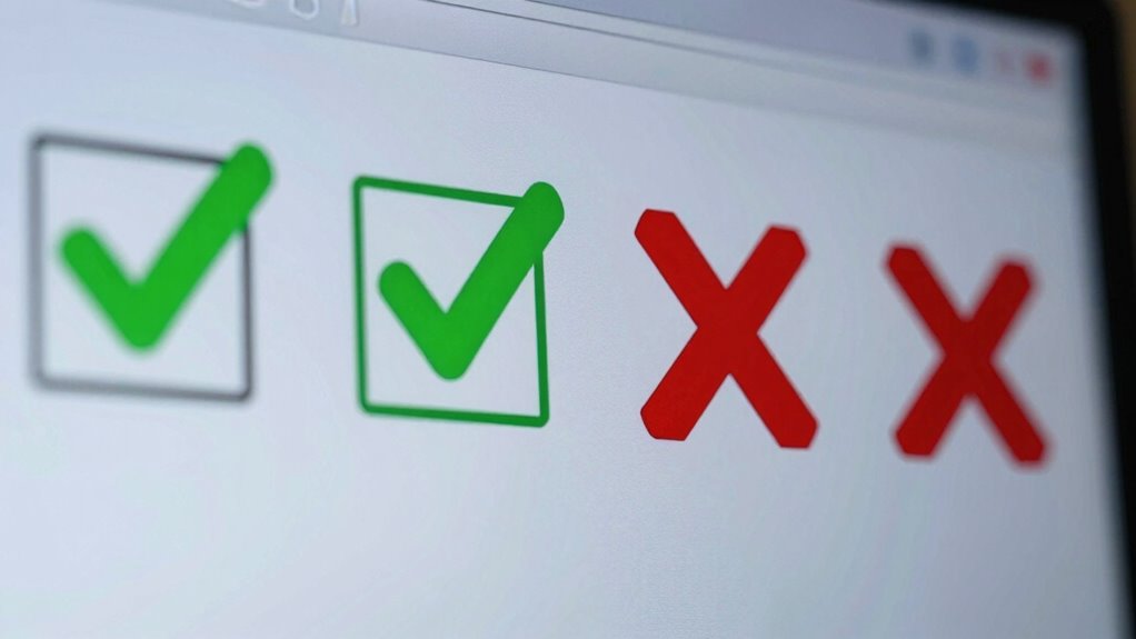

Green checks and red X symbols in interfaces provide instant signals of success or errors. You use green checks when tasks are completed correctly or approved, offering reassurance. Red X symbols warn you about problems or needed corrections. These icons help you understand what actions to take quickly, making navigation smoother. Relying solely on these symbols can cause issues for some users, so pairing them with text enhances clarity. Keep exploring to discover more about designing clear visual cues.

Prime made for students and young adults
- Fast, free delivery for dorm and study essentials
- Prime Video and Amazon Music included
- Member-only deals
Key Takeaways
- Green checks signify success, approval, or correct completion of a task in interfaces.
- Red X symbols indicate errors, issues, or actions that require attention.
- These symbols provide immediate visual feedback to guide user decisions and actions.
- They should be paired with labels or other indicators to ensure accessibility for all users.
- Proper use of these symbols improves clarity, reduces confusion, and enhances user experience.
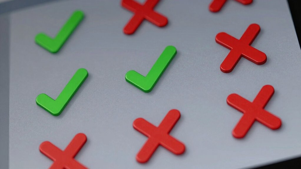
Have you ever wondered what those green checkmarks and red X symbols really mean when you see them on a screen? These symbols are more than just visual cues; they’re a language of their own that guides your understanding and actions within digital interfaces. Green checks typically indicate success, approval, or that a task has been been completed correctly. Conversely, red X symbols signal errors, problems, or that something needs your attention. Recognizing these symbols helps you navigate digital environments efficiently, but their true significance extends beyond simple visual cues.
Designers incorporate these symbols intentionally to provide immediate, clear feedback on your actions. When you submit a form or complete a process, a green check confirms that everything went smoothly, reassuring you that no further steps are necessary. If something’s wrong, a red X quickly alerts you that adjustments are needed before proceeding. This instant feedback minimizes confusion and keeps you engaged, allowing you to correct mistakes on the spot. It’s a straightforward way for interfaces to communicate success or failure without requiring lengthy explanations. Additionally, understanding the visual language of icons like these enhances overall user experience.
Green checks confirm success; red Xs highlight issues, providing quick, clear feedback to guide your next steps.
However, relying solely on color can pose accessibility challenges. Not everyone perceives colors in the same way, especially users with visual impairments or color blindness. That’s why good interface design considers accessibility considerations by pairing these symbols with text labels or other visual indicators. For example, a green checkmark might be accompanied by the word “Confirmed” or “Success,” ensuring that all users understand the message, regardless of how they perceive color. Such practices make digital platforms more inclusive, allowing diverse users to interact confidently with the interface. Effective communication in user interfaces depends on these thoughtful design choices.
User feedback plays an essential role in refining how these symbols are used. When designers gather input from real users, they learn whether visual cues are effective or if they need adjustments. Sometimes, users find red X symbols too alarming or confusing, prompting designers to consider alternative approaches like subtle icons or additional text explanations. By paying close attention to user feedback, developers can improve clarity, reduce frustration, and create a more accessible experience for everyone. Moreover, incorporating alternative indicators can cater to different preferences and needs, fostering broader usability.
In essence, green checks and red X symbols aren’t just simple icons—they’re key tools in user interface communication. They help you understand the status of your actions instantly, but their effectiveness depends on thoughtful design that embraces accessibility considerations and values user feedback. For example, some symbols might resemble piercing-related concepts, but their core purpose remains to provide clear, immediate feedback. When these symbols are used wisely, they make your digital interactions smoother, clearer, and more inclusive. Understanding these symbols is crucial for effective digital interaction and accessibility.
digital interface success and error icons
As an affiliate, we earn on qualifying purchases.
As an affiliate, we earn on qualifying purchases.
Frequently Asked Questions
Are Green Checks Universally Understood Across All Cultures?
Green checks are generally understood across many cultures as symbols of correctness or approval, but they aren’t universal. Cultural symbolism influences how symbols are interpreted; in some regions, colors and icons may carry different meanings. As a user, you should recognize that visual language varies, and relying solely on green checks might lead to misunderstandings. Always consider cultural context when designing or interpreting symbols to guarantee clear communication worldwide.
Can Red X Symbols Have Different Meanings in Various Contexts?
Red X symbols are like chameleons, changing meaning based on the context. You’ll find that symbol consistency isn’t always maintained, especially across cultural variations. In some places, a red X signifies error or disapproval, while in others, it might indicate cancellation or rejection. So, you should be cautious about assuming a universal meaning, as the interpretation hinges heavily on the specific cultural and contextual cues.
How Do Color-Blind Users Interpret These Symbols?
As a color-blind user, you might struggle with green checks and red X symbols because of limited color contrast. You rely more on symbol shape and consistency across the interface to interpret meanings. To improve accessibility, designers should guarantee symbols are distinct in shape and maintain symbol consistency, so you can understand feedback regardless of color perception. Clear, recognizable icons help everyone navigate interfaces with ease.
Are There Alternative Symbols Used in Different Interface Designs?
Many interface designers diversify their design with distinctive, dynamic, and culturally conscious alternative iconography. You’ll find symbols like thumbs up, checkmarks with circles, or distinct shapes, tailored to cultural symbolism, to clearly communicate status. These alternatives help bridge language barriers and enhance understanding, especially for users with visual or cultural differences. By choosing culturally aware icons, you make interfaces more inclusive, inviting, and intuitive for everyone.
How Do These Symbols Impact User Trust and Decision-Making?
Green checks and red X symbols boost user confidence by providing quick, clear visual cues. They improve visual clarity, helping you quickly assess options or statuses without confusion. When these symbols are consistent and intuitive, they guide your decision-making smoothly, reducing hesitation and errors. However, inconsistent or ambiguous symbols can lower trust, causing uncertainty. Ultimately, well-designed symbols foster a seamless user experience, encouraging you to rely on the interface confidently.
Conclusion
Understanding what green checks and red X symbols mean can transform your interface experience from confusing to crystal clear. These symbols are like the ultimate language of digital communication, guiding you effortlessly through tasks. When you recognize their significance, you’ll navigate interfaces faster than a lightning bolt, avoiding mistakes and saving time. Embrace these symbols, and you’ll wield the power to conquer any digital challenge with confidence—making your interactions smoother than ever before!
Halloween Picks
halloween
As an affiliate, we earn on qualifying purchases.